What Colors Go with Everything & How to Build a Timeless Wardrobe


Dante Kim
Oct 5th, 2024
Get your color analysis done
in 60 seconds with WhatColors!
Get your color analysis done in
60 seconds with WhatColors!
Get your color analysis done in 60 seconds with WhatColors!
Imagine you’re running late for work or a dinner date. Frantically, you throw on a pair of pants and a top, only to realize they clash terribly. Now, you must start all over, wasting precious time and adding to stress. Some best-color-combinations color combinations are easy when color-matching clothes, while others can feel nearly impossible. This article will help you discover how to effortlessly create a versatile and stylish wardrobe where every piece matches perfectly, making outfit choices simple and timeless.
WhatColors’ AI personal color analysis app can help you achieve your goals with a detailed color analysis that identifies your unique color palette. This personalized approach takes the guesswork out of color matching and provides simple insights to help you create a stylish wardrobe that any piece will easily match.
Table of Contents
How Important Is Color Coordination When Matching Your Wardrobe?
How to Match Clothes: More Things to Remember
What Colors Go with Everything in Your Closet?
How To Know What Colors To Match?
What Are The Principles For Matching Colors?
Try AI Personal Color Analysis For Free Today
How Important Is Color Coordination When Matching Your Wardrobe?
Color coordination is essential for achieving a cohesive and polished look. It’s no wonder that color coordination is one of the first things that professionals consider when putting together a wardrobe for their clients and struggling to find the perfect outfit every morning. The culprit might be a lack of color-coordinated outfits in your closet. The word “coordination” developed from the Latin “co” + “order,” “order,” meaning “to arrange in order.” The right color combinations can elevate your:
Appearance
Enhance confidence
Simplify outfit choices.
Dressing well is about mastering composition, unlike painting or taking a photo. You can use each piece of your attire to create a portrait that can project an image ranging from dull to understated to inspired to over-the-top. So how do we put together all the diverse components of attire:
A suit, shirt, tie, pocket square, belt, shoes, socks, and vest?
What about pants, a shirt, a sweater, etc, in casual clothes?
You’ll be happy to know that you can follow some “rules” to make coordinating shirts, ties, and suits simple. These methods work equally well when pairing khakis with a polo shirt!
The Elements of Clothing Coordination
We’re going to focus on a four-part clothes coordination formula. These four elements can make a big difference in your image. It is comprised of:
Pattern
Color
Fabric Weight
Fabric Texture
A pattern can make you laugh or give you an exciting look. Color can make your complexion look tremendous or washed out, sending messages like “I’m trustworthy” or screaming gaudy. Fabric texture and weight can be crucial to the appropriateness of your attire for the time of day or time of year.
Observe people on:
Malls
Office
Airport
Pick out those who seem unsightly; something doesn’t quite seem right with their attire. Chances are one or more of these four elements will be out of balance or “unattractive.” For example, some men try to jazz up the traditional formalwear ensemble, which they think is boring. This is usually a mistake, resulting in a loud, busy, or other discord in classic attire. Plus, there can be too much matching. His and her identical Hawaiian shirts come to mind.
How to Wear Patterns
Too many patterns, and you’ll resemble a clown. The strongest authoritative professional clothing is no pattern, which is a solid color. One of the rules for the coordination of a suit, tie, and dress shirt is “Two Plains and One Fancy,” meaning that the three items, the tie and suit, should always be plain (solid), and the third should be fancy (patterned). People always remember solids the longest. That’s why guys look so elegant and handsome in attires that has two colors because it is:
Patternless
High contrast
Formal wear
For example, if you wear a solid suit and a solid shirt, you should not wear a solid tie. Select a tie with a pattern. But, if you wear a striped shirt, you should wear a solid tie and suit. And, if you wear a Glenn plaid suit, I should wear a solid shirt and a solid tie. This is good advice when building a wardrobe, but you will successfully mix patterns as you get adventurous. A pinstripe suit with a striped shirt and a small patterned tie can look fabulous!
How to Mix Patterns
You can mix two or more patterns just to ensure that some of the colors in each match and the patterns are not the same size or type. The fundamentals of mixing patterns as you learn how to match clothes require analyzing each pattern for:
Size (scale)
Type or design (stripe, polka dots, geometrics, etc.)
Color Intensity (bold or subtle)
For example, with a check shirt, try a tie with small patterns, and bright strong patterns should be paired with subtle ones. Note that suit patterns, such as a pinstripe or a subtle plaid, work almost like a solid since you must be close to see the pattern.
Working With Color
In the article on Color Coordination, we’ve learned these guiding principles for working with colors:
Complementary colors: Are those directly opposite one another in the color spectrum or wheel. That’s why hunter-green pants look great with a burgundy sweater. Blue is the opposite of orange, so gold, rust, and brown are complementary shades of blue.
Analogous Colors: Colors, next to each other on the color wheel, go well together, such as blue pants, a blue-green shirt, and a forest green jacket.
Warm and Cool: Select two warm colors with one cool or two with one warm to create dynamic harmony. Examples: a Navy suit, light blue shirt, red tie, or a yellow shirt, rust jacket, and blue jeans.
Monochromatic: Can be all one color or different shades, tones, or tints of one color—neutral. Dress in shades of white, black, gray, or beige. The neutrals are khaki pants, a white shirt, and a gray sweater. It may not be a dynamic look, but it is sophisticated.
Seasonal colors: Some colors are more appropriate at certain times of year than others. Yellow pastels are usually associated with summer, while autumn colors are rust, brown, green, and burgundy. Wearing rust in the summer or light yellow in the fall looks out of place.
Understanding Color Terms: Hue, Tone, Tint, and Shade
The Color Spectrum or Wheel: A Visual Presentation of Some Color Terms:
Hue: The pure color (Red)
Tone: Hue + small amount of gray or opposite color (will or tone down the color)
Tint: Hue + White (will lighten the color)
Complement Tint: Tint + small amount of gray or opposite color(will mute or tone down the color)
Shade: Hue + Black (will darken the color) Sir Isaac Newton developed the first circular diagram of colors in 1666
Color Value on Visual Perception
Value is the degree of lightness or darkness in color. It’s the quality by which a pale or light color is distinguished from a deep or dark one:
Shades, tints, and tones can express values
Dark and dull colors recede, thus making you look thinner and smaller
Light and bright colors project, which tends to bulk you and make you look larger
Andy’s advice: If you’re trying to look slim while learning to match clothes, save the bright colors for accents. With a gray or navy suit, a red or yellow tie will draw favorable attention to your face.
The Psychology of Color: How Color Affects Perception and Style
Want to emphasize your shoulders and de-emphasize your hips? Wear a lighter-colored sports jacket and dark trousers. (You can also apply this principle to a polo shirt and trousers):
Dark colors are more formal than light
Bright colors in large amounts become tiresome to the eye
Men with muted or softer coloring look better in “dusty or hazy” colors with a touch of gray or faded
For example, light hair and skin would pair well with powder blue. Men with darker complexions and hair look better in bright, crisp, clear, rich colors that pop out, such as navy blue.
Mastering Color Contrast: Creating a Balanced Outfit
Another “rule” says one of the three elements should be light, the other two dark. Try one light element with two dark or one with two lights through this example:
A charcoal suit (dark), white shirt (light), and red tie (dark)
Tan suit (light) with yellow shirt (light) and green tie (dark)
Even on Regis, the tie and shirt look best when they contrast. And unless you’re a cast member of the Sopranos, the tie should be darker than the shirt! The traditional strong contrast of a navy suit and white shirt works well with every skin and eye color, just like formalwear's classic black and white look. Two principles guide the choice of colors: matching and contrasting. Another example is:
If you are tall, you may (as we discussed in the body styles) want to contrast the top and bottom of your attire (dark sports jacket and light-colored trousers) to give a break to the eye, thus making a horizontal line that makes you look shorter
If you are short, do the opposite and try to match the color and intensity of the top and bottom of your ensemble more closely. Short or heavy gentlemen look great in suits since matching top and bottom produce a “taller, thinner” image.
Achieving Color Harmony and Avoiding Monochrome or Harsh Contrasts
A dark blue tie with a pale blue shirt and a blue or gray suit are examples of color harmony as you learn how to match clothes. Substitute a red or maroon tie in this outfit, and you have color contrast. There is much to learn in color coordination. Too close a color harmony results in a monochrome effect and can be tedious. And too much contrast can be harsh.
Fabric Weight
Heavier fabrics, such as 11 to 16-ounce wool suit fabrics, corduroy, suede, and leather, are worn in the fall and winter. Heavier fabrics give the impression of a heavier body. Take the tie, for example; silk is correct all year round, but in winter, you can add a wool tie to the ensemble.You have introduced a heavier fabric element that must be carefully balanced. These fabrics include:
Tweed
Flannel
Bulky sweaters
In contrast, lighter-weight fabrics, such as seersucker and linen, are more common in the spring and summer. Light to medium-weight fabrics visually remove pounds. Light/medium fabrics include:
Cotton
Twill
Linen
Fabric Texture
Texture makes a statement. You can use the quality of roughness or smoothness in fabrics to help coordinate your attire and present the appropriate image:
Smooth parallels are dark as dressier and give authority and power, but you can be too smooth or slick, projecting a cold, elusive, distrustful appearance. Silk ties are dressier than wool, and smooth suit fabrics are dressier than tweed.
Rough textures parallel lighter colors, projecting an accessible and friendlier image.
You can contrast (smooth with rough) or match (smooth with smooth, rough with rough) textures. The balance between textures also should be considered. Oxford cloth shirts are the most textured dress shirt and call for a smooth tie and suit for the most dressy business situations, but an oxford shirt and a wool tie with corduroy pants are a great casual winter look. A wool cable knit sweater can add texture to your attire.
How to Match Clothes: More Things to Remember
Think about the situation you’ll be in, and the image you wish to convey when you choose your clothes. You don’t always want to project a power authority image. Sometimes you want to appear as a friendly, “let’s work together” person.
Related Reading
• What Are Neutral Colors
• Color Wheel for Clothes
How Do I Work Out Which Colors Suit Me?
Getting color right is particularly useful when shopping for clothes, as it can help you narrow down the vast options available to ensure you find pieces that will flatter you. Personal color analysis is all about determining which colors complement your unique features, such as:
Hair
Eyes
Skin tone
On the flip side, the wrong ones can have the opposite effect, so it’s no wonder that color can impact how confident we feel in our clothes. You'll know what I mean if you’ve ever felt drawn to a specific color, only to try it on and look washed out or sick. There are a few different methods of personal color analysis, but they all have the same goal: to help you figure out which shades will suit you best. The right shades can enhance your natural beauty and make you look:
Healthier
Younger
More Vibrant
Start With Your Undertone
Your skin tone can change with the seasons, becoming paler in winter and darker in summer. However, your undertone remains the same, so it’s best to identify this first. It will help you find the right shades all year round. You might have a warm, cool, or neutral undertone, and determining this will make it easier to find the colors that will best complement you.
The Paper Test
Finding out your undertone can be as simple as holding a sheet of white paper up to your neck, not your face, as our faces can sometimes appear reddened by various skin issues. Make sure you’re in good natural light when you do this. You likely have a warm undertone if your skin appears yellowish against the paper. If it seems pinkish or rosy, you’re cool. You're neutral if you don’t see any noticeable undertone or your skin appears greyish.
Check Out Your Veins
Another way is to look at the color of your veins. Find where your veins are most noticeable. The inside of your wrist is usually the best place. You probably have a cool undertone if your veins appear blue or purple. If they appear more green, you’re warm. If you can see both colors, you’re likely neutral.
What color Jewellery Suits You?
You probably already know what color jewelry suits you best, and it can be a simple indicator of your skin’s undertone. If you’re unsure, grab some gold jewelry and silver pieces and try them out:
If gold complements you best, you have a warm undertone
If it’s silver, you have a cool undertone
If neither looks better, you can bet you’re neutral
Color Theory for Everyday Life: Choosing the Best Colors for Your Skin Tone
Now that you’ve established your undertone, it should be easier to determine which colors will work best for you and help make shopping for color a little less overwhelming:
Warm: You guessed it, you’re looking for warmer colors – orange, amber, golden yellow, warm reds, coral pinks, magenta. Earthy tones, if you will. But it doesn’t mean you can’t go for traditionally cooler colors too – like blues and greens – opt for their warmest versions, such as olive green and deep turquoise. Neon colors will also work for you, but avoid cool colors like ice blue and jewel tones, which could make your skin look greyish.
Cool: Yep, you want traditionally cooler colors. If warm nods to earthy colors, then cool nods to watercolors. Bright blues, emerald green, and deep purple, jewel tones in general, work well for cool tones, as do pastels like lilac, lavender, mint green, and rosy pinks. Avoid orange, tomato red, and strong yellows, as these can wash you out.
Neutral: The joy of a neutral skin tone is that any color complements it, though generally it’s recommended that you opt for muted shades over brighter ones.
Again, this is a guide, not a rulebook, and sometimes the guidelines don’t ring true for everyone for various reasons. Sometimes the best method is simply trial and error, heading to the shops and trying on a ton of stuff to see which colors you feel and look best in.
Start Small
If, like me, you’ve been steadfastly dedicated to building a neutral wardrobe for most of my adult life, switching to head-to-toe color immediately is probably a little too daunting (and expensive). So start small.
Accessories are the easiest way to test new colors and how they make you feel. Whether it’s a pair of trainers, heels, hair clips or a handbag, use an accessory as your gateway piece for how to wear color.
Don’t Forget Your Neutrals
Even if you’re determined to get more colorful, your wardrobe still has room for neutrals. They’re pretty essential. A good base of neutral pieces will make incorporating color so much easier. So, what exactly are neutrals? They’re colors that can be paired with anything. They are not attention-grabbing. They gracefully blend in. What constitutes a neutral is different for everyone, and just like brighter colors, not all neutrals suit everyone.
These are the classic colors:
Black
White
Grey
Navy
Beige
For example, neutrals are navy, black, white, and occasionally grey if it’s the right heather-hued shade. Beige, in any shade, doesn’t suit me, so I never buy it. I also consider denim neutral, sticking to the same mid-blue shade. It’s different for everyone and something you need to think for yourself. But a good base of neutrals creates a brilliant backbone to a colorful wardrobe, and they’re most valuable when they take the form of ‘wardrobe essentials’ like:
Plain T-shirts
Shirts
Trousers
Simple knitwear
Go Tonal
If the previous section detailing the color wheel left you feeling a little overwhelmed but you’re still keen to dive headfirst into wearing more color, tonal dressing, sometimes called monochromatic dressing, maybe the technique for you. It’s simple: dressing head-to-toe in different shades or tones of one color. It’s an easy way of making color work for you without thinking about it too much.
The key to getting it right is mixing your textures, which creates contrast and depth:
Mix a silk or satin shirt with colored denim or a wool jumper with a leather skirt.
Use accessories to break it up
If you’re going for a tonal green outfit, try adding a bag or shoes in a complementary contrasting color
WhatColors: The AI-Powered Personal Color Analysis App
WhatColors helps you find what colors to wear based on your skin tone. Finally, get your season based on our skin tone, thanks to our patented color match technology. Get the perfect colors based on your season. Avoid colors that are a definite no. Based on your skin, eye and hair color, find the perfect nail colors with our WhatColors nail color generator.
Get your color analysis done within 60 seconds with WhatColors’ AI personal color analysis app. Download our app for free today on the App Store or Google Play store.
What Colors Go with Everything in Your Closet?

The Obvious Choice: Black
For many, black is the go-to color, and it's easy to see why. Black items go with everything, and they also have practical benefits. For instance, black doesn’t show stains or wrinkles like lighter colors, making it the perfect choice for travel and work. From a style perspective, black is so versatile that it’s often easier to pair bold colors and patterns with black instead of lighter shades.
The Blank Canvas: White
Like black, white goes with everything. But instead of a stylish backdrop for your colorful pieces, white offers a crisp, clean base to build the rest of your outfit. I can’t think of any color it wouldn’t pair nicely with. And if you’re trying to lighten up your look but still love black, white is the perfect alternative. Think of a classic white button-up.
This simple shirt looks great with:
Jeans
Shorts
Skirts
Dresses
The Unexpected Hero: Camel
Camel is a surprising neutral that only some know about. It’s rich and deep, tan and brown mixed perfectly, and you can pair it with other neutrals or brighter colors as you see fit. It’s no wonder fashion pundits labeled Gisele Bündchen as being in her “rich mom” era with this luxe coat.
The Transitional Staple: Tan
A lighter version of a camel is tan, a classic trench coat color. That’s no accident. Tan goes well with all colors and would work instead of white (or with white). The spring and fall staple work perfectly in transitional weather because you can throw a tan trench coat over anything you might be wearing.
The Cool Alternative: Olive
Olive was a 2010s staple—the color of the ubiquitous jacket we all got tired of seeing. But olive is way more than that. It’s a couple of shades brighter than black but can be worn like black, as a stylish piece of outerwear, or as a base layer. It also works beautifully when you pair it with lighter hues like white and beige.
The Navy Factor: Navy
Navy is the spiritual sister to black, which means it goes with almost as much in your wardrobe:
It goes with blue pants
It goes with white tops
It often goes with florals and patterns
It goes with denim for a tonal, all-one-color vibe
It even goes with black
Note: The rule that you can’t mix navy and black (or any of your neutrals) is outdated and not true.
The Unexpected Twist: Powder Blue
If you’d instead opt for a lighter version of the classic hue, choose a blue that is not far from white. Powder blue is mild enough to be worn instead of white, and it’s just a bit surprising if you’re looking to inject some fun into your looks. You might need to experiment with the shade of blue that works best for you, but then you can move forward with it as a new neutral.
The Classic: Denim
There’s a reason why denim is so beloved and has stood the test of time. It is a “bridge” between colors but light enough to contrast. It also matches well with lighter colors, keeping the look more grounded, meaning it is dark enough to match with black:
Jacket
Shoes
Belt
Bag
Bonus: The Canadian tuxedo.
The Underrated Color: Brown
In adulthood, I’ve come to appreciate brown for its beautiful color. Brown is not just a muddy substitute for black. It can be:
Vibrant
Soft
Subtle
It’s probably my favorite alternative to black because it automatically brings dimension to your look. See how much cooler this tonal-brown outfit is than an all-black alternative!
The Surprising Neutral: Burgundy
Believe it or not, burgundy is a surprisingly impressive neutral, and just about anyone can find a hue that works for them! Like brown, olive, and navy, it’s a few shades brighter than black but can be worn as if it’s black. Look how much cooler this simple outfit is:
Black sweater
Jeans
Black bag
Burgundy jacket
The Pattern That Acts As a Neutral: Stripes
Hear me out: While it’s not a color per se, stripes can act as a neutral in your wardrobe. I promise! Just ensure that the striped pattern's colors mesh well with the rest of your wardrobe. So, in this case, blue jeans and a white blazer match expertly with a blue and white striped shirt. Use it in place of a white or blue top.
Leopard
We know what you’re thinking. How is that neutral? But before you scroll away, hear us out. Because leopard consists of neutral colors such as:
Tan
Brown
Black
The print is super-versatile—it can match any color and look fantastic. It even looks great with other prints, such as stripes, because the bold patterns and neutral colors are compatible.
Chambray
The chambray is the new white button-up. In 2014, the denim-blend top is still relevant, proving that the chambray button-up is a wardrobe classic rather than a passing trend. Like how blue jeans go with everything, blue chambray offers the same versatility with all the classes of a button-up top. The subtle indigo tone is more casual, but its hue is universally flattering and complementary, meaning everyone looks great in it, and it matches everything.
Related Reading
• Outfit Color Combos
• Fashion Tips
• What Matches with Blue
• Yellow Color Combinations Clothing
How To Know What Colors To Match?
The color wheel helps break down color relationships and informs color harmony. Let’s look at the basics. Color matching starts with identifying color relationships on the color wheel. The color wheel consists of:
Primary colors: Primary colors include red, blue, and yellow. These three shades create every other color and cannot be achieved by mixing different hues
Secondary colors: Secondary colors form by combining equal parts of two primary colors. For example, red and yellow create orange, red and blue make purple, and blue and yellow create green
Tertiary colors: Tertiary colors develop by mixing primary and secondary colors. You may know these as hues like coral, burgundy, navy, and olive.
The color wheel also helps differentiate between:
Warm colors: Warm colors include red, orange, yellow, and their derivatives
Cool colors: Cool colors include blue, green, purple, and their derivatives
Neutral colors: Neutral colors are understated tones like black, white, gray, and taupe.
Color Temperature
Color temperature plays a critical role in determining your overall appearance. The warmth or coolness of the color can help enhance your skin tone and even convey your mood and emotions. Also, wearing color tones that match your undertones can uplift your look and make your skin look healthier and brighter. While the wrong color tone can make skin look washed out or dull.
Understanding color temperature and how it goes with the season, occasion, skin tone, and mood can help you make the right fashion choice. Check out the next section to see what you should remember while matching colors.
Color Schemes for Outfits: Start with the Basics
So, how do you use the color wheel to match your clothes? Start by selecting a color scheme. Color schemes, or combos, help create balance in your outfits. The most popular color schemes include complementary, analogous, and monochromatic. Once you understand these combos, you can experiment with your outfits for a unique look that expresses your style.
Complementary Color Schemes: Opposites Attract
Complementary color schemes offer the highest contrast of all color combos. This scheme consists of two colors directly opposite each other on the color wheel. For example, these are all complementary pairs:
Red and green
Blue and orange
Yellow and purple
These combinations can make your outfits pop, so use them carefully. Too much contrast can create a chaotic look, so try to balance your outfits by using one color for most of the look and the other for accent pieces.
Analogous Color Schemes: Subtle and Sophisticated
Analogous color schemes consist of three colors located next to each other on the color wheel. For example, yellow, yellow-orange, and orange form an analogous color scheme. Outfits built on these color schemes create serene looks, perfect for professional settings or elegant events. To avoid looking too much like a walking color swatch, select one color to dominate your outfit and use the others for pops of color.
Monochromatic Color Schemes: One Color, Many Variations
These color schemes are straightforward to pull off. Not only do they create a harmonious look, but they also eliminate the stress of color matching. Monochromatic color schemes include one color in:
Shades
Tones
Tints
For example, a look built on blue might incorporate navy trousers, a baby blue top, and a turquoise statement necklace.
What Are The Principles For Matching Colors?
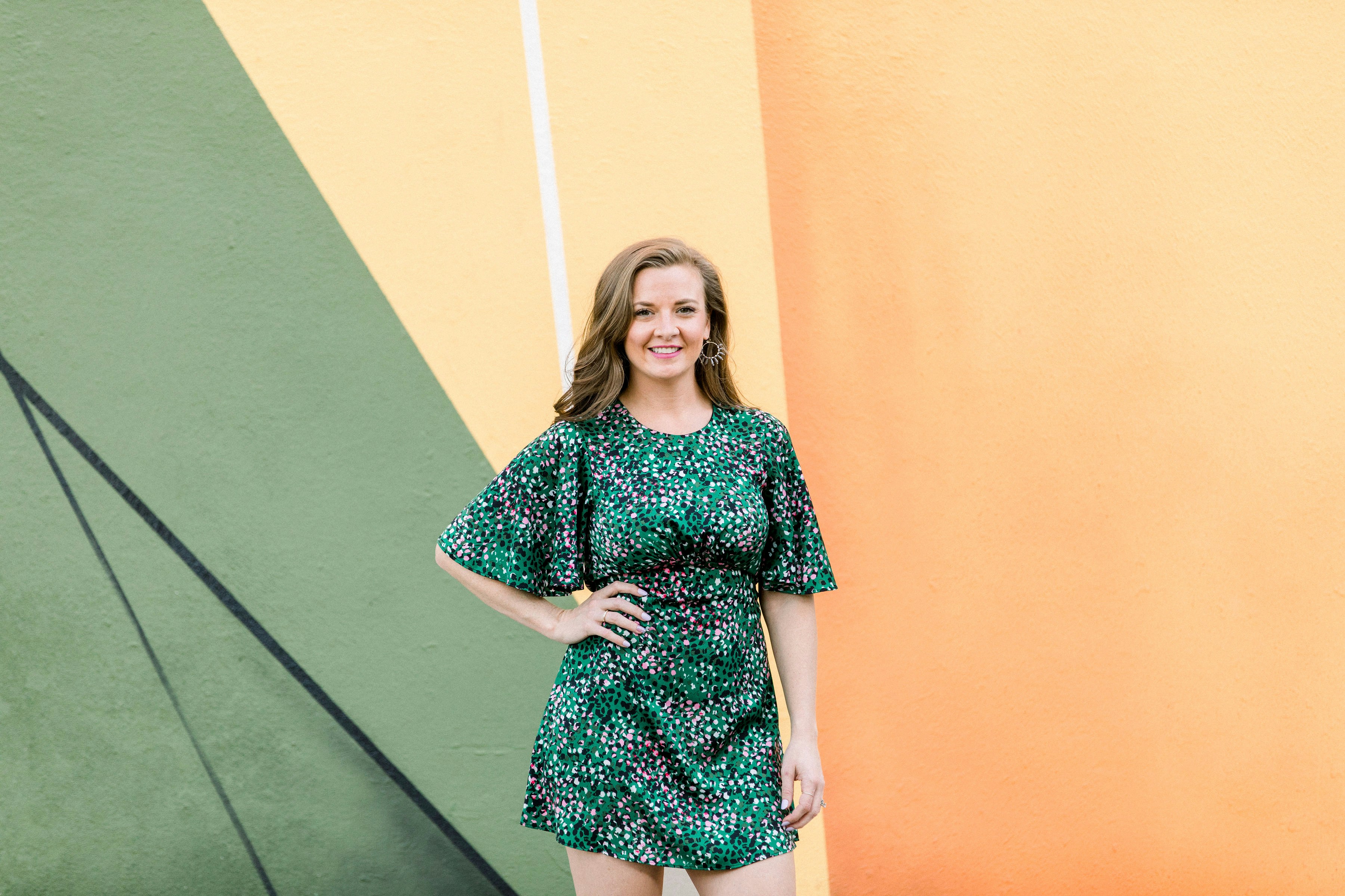
Color matching can be a tricky business. On the one hand, color theory provides a scientific approach to choosing hues that look good together. On the other, styling outfits is inherently creative and subjective, so rules can be bent or broken to achieve the desired aesthetic.
One fundamental principle for matching your clothes, or anything, is combining colors that work in harmony. And that’s what we must remember while designing or putting our outfits together.
Here’s how you can match them.
Use the Color Wheel to Find Complementary Colors
Complementary fashion color, as the name goes, works best when put together. These are exactly opposite to each other on the color wheel. They might seem bold, but the outputs will be perfect. If you observe, your spring and summer clothing is mostly designed using complementary colors. While some might argue against this concept, it is a matter of choice, as some like making bold statements.
These are:
Red and green
Violet and yellow
Blue and orange
Quick Tip: Split-complementary is an experimental principle of color-matched clothing in fashion. You pick a color and match it with neighboring shades of the complementary color.
Level Up Your Style with Analogous Colors
Matching two or three continuous shades on the color wheel that blend well is analogous to color matching. When you put an entire outfit together based on this, it looks both striking and stylish. If you want to style that orange or camel trench coat of yours, pick a shade on either side of the color in the color wheel and work with that.
Try Triadic Color Combinations
The combination of colors equidistant from each other on the color wheel is called triadic. They look great together, but some might argue they can be OTT. However, you can choose the muted shades of these colors to make your outfit. A pair of green cargos with a pastel pink top and powder blue accessories or shoes will look sophisticated and tasteful.
Perfect color Combination For Dresses
Keeping it in the family is a mantra you need to remember. The safest way to do this is by blending shades of the same color. However, this type of chromatic dressing will inevitably get monotonous and boring very soon. Remember how we discussed complementary colors? (Red and green, violet and yellow, blue and orange.) Play around with a combination of these colors; they will look great when put together.
The Ombre Test
Ombre is taking over everything from hairstyles and cakes to nail art and decor, and not to forget, outfits. Diminishing shades of the same color in ascending or descending order works excellent. You can turn heads when you wear an ombre on:
Party-wear outfits
Bridesmaid dresses
Simple jeans and tops
Wear ombre outfits for your Christmas or winter parties; they match the theme and weather. If you are sporting separates, you need to bring it all together in sync with the:
Top
Bottom
Shoes
Accessories
Monochrome Look
It seems like a no-brainer because it’s just one color in the same shade for the outfit. However, this color coordination is the hardest to pull off for obvious reasons. The excellent news is that monochromatic looks have caught up and are no longer considered weird. Start with comfortable neutral colors like grays, blues, whites, and blacks, then progress to pastel undertones.
Monochrome looks can be customized depending on the season or occasion. If it’s a formal setting, stick to neutrals, blues, or whites; otherwise, explore pastels, yellows, or even brighter shades.
One Thing At A Time
If it’s a printed or patterned outfit, let the print take over. Prints and patterns usually combine one or more colors, so you must leave it at that. Keep the accessories in the neighborhood; more colors only make it clumsier and unruly.
The Balancing Act
Another trick of the trade is to balance out any colors you choose to mix carefully. Anything done proportionately is a foolproof way of coordinating your outfit. Like they say, too much of anything is good for nothing. An enthusiastic fashion blogger known for her insights into clothing and style, she expresses her admiration for different colors, styles, and prints.
When talking about color combinations, she says. “I love how the two dark colors combine, giving me one long line. And I love the warm richness of this combination. Brown and black are classic neutrals, meaning they go with everything, including each other.”
Match It With Your Skin Tone
If you are pale or yellow-toned, go for the warmer side of the palette. You can pull off brighter or warmer shades of brown, coral, honey, gold, amber, taupe, etc., as they look amazing on this skin tone.
If you have cooler undertones, choose cool shades like grey, navy blue, varying shades of green, aqua, emerald, burgundy, etc., as they can be the perfect color combination for your dress that suits your tone. The same applies to your eye makeup, too.
When In Doubt – Err On The Neutral Side
Some people prefer being muted and subdued with their choice of colors, opting for just neutral shades. This is a great color combination for a dress, especially for formal occasions. If this is you and you do not want to change drastically, go with one cool or warm color and leave everything else neutral. It’s always best to keep it this way!
Try AI Personal Color Analysis For Free Today
WhatColors is a mobile app that helps you find what colors go with your skin tone. Finally, thanks to our patented color match technology, you can get your season based on your skin tone. First, we analyze your skin, eye, and hair color to get your seasonal palette. The app provides the perfect colors based on your season. You will also avoid colors that are a definite no. Finally, the app helps you find the ideal nail colors with our WhatColors nail color generator.
Get your color analysis done within 60 seconds with WhatColors’ AI personal color analysis app. Download our app for free today on the App Store or Google Play store.
Related Reading
• Colors That Go with Brown Clothes
• Stylish Outfits for Women
• How to Choose Eyeshadow Color According to Dress
• Casual Outfits for Women
• Bright Color Palette
• Neutral Color Palette
• What Colors Go with Everything
• Colors That Go with Navy Blue
• What Colors Go with Yellow
• What Colours Look Good with Grey Clothes
• What Color Goes with Navy Blue
• Colors That Go with Dark Blue
• What Colors Match with Brown
• Clothing Color Combinations
• Clothing Styles for Women
• How to Dress Better
• Color Matching Clothes
Get your color analysis done
in 60 seconds with WhatColors!
Imagine you’re running late for work or a dinner date. Frantically, you throw on a pair of pants and a top, only to realize they clash terribly. Now, you must start all over, wasting precious time and adding to stress. Some best-color-combinations color combinations are easy when color-matching clothes, while others can feel nearly impossible. This article will help you discover how to effortlessly create a versatile and stylish wardrobe where every piece matches perfectly, making outfit choices simple and timeless.
WhatColors’ AI personal color analysis app can help you achieve your goals with a detailed color analysis that identifies your unique color palette. This personalized approach takes the guesswork out of color matching and provides simple insights to help you create a stylish wardrobe that any piece will easily match.
Table of Contents
How Important Is Color Coordination When Matching Your Wardrobe?
How to Match Clothes: More Things to Remember
What Colors Go with Everything in Your Closet?
How To Know What Colors To Match?
What Are The Principles For Matching Colors?
Try AI Personal Color Analysis For Free Today
How Important Is Color Coordination When Matching Your Wardrobe?

Color coordination is essential for achieving a cohesive and polished look. It’s no wonder that color coordination is one of the first things that professionals consider when putting together a wardrobe for their clients and struggling to find the perfect outfit every morning. The culprit might be a lack of color-coordinated outfits in your closet. The word “coordination” developed from the Latin “co” + “order,” “order,” meaning “to arrange in order.” The right color combinations can elevate your:
Appearance
Enhance confidence
Simplify outfit choices.
Dressing well is about mastering composition, unlike painting or taking a photo. You can use each piece of your attire to create a portrait that can project an image ranging from dull to understated to inspired to over-the-top. So how do we put together all the diverse components of attire:
A suit, shirt, tie, pocket square, belt, shoes, socks, and vest?
What about pants, a shirt, a sweater, etc, in casual clothes?
You’ll be happy to know that you can follow some “rules” to make coordinating shirts, ties, and suits simple. These methods work equally well when pairing khakis with a polo shirt!
The Elements of Clothing Coordination
We’re going to focus on a four-part clothes coordination formula. These four elements can make a big difference in your image. It is comprised of:
Pattern
Color
Fabric Weight
Fabric Texture
A pattern can make you laugh or give you an exciting look. Color can make your complexion look tremendous or washed out, sending messages like “I’m trustworthy” or screaming gaudy. Fabric texture and weight can be crucial to the appropriateness of your attire for the time of day or time of year.
Observe people on:
Malls
Office
Airport
Pick out those who seem unsightly; something doesn’t quite seem right with their attire. Chances are one or more of these four elements will be out of balance or “unattractive.” For example, some men try to jazz up the traditional formalwear ensemble, which they think is boring. This is usually a mistake, resulting in a loud, busy, or other discord in classic attire. Plus, there can be too much matching. His and her identical Hawaiian shirts come to mind.
How to Wear Patterns
Too many patterns, and you’ll resemble a clown. The strongest authoritative professional clothing is no pattern, which is a solid color. One of the rules for the coordination of a suit, tie, and dress shirt is “Two Plains and One Fancy,” meaning that the three items, the tie and suit, should always be plain (solid), and the third should be fancy (patterned). People always remember solids the longest. That’s why guys look so elegant and handsome in attires that has two colors because it is:
Patternless
High contrast
Formal wear
For example, if you wear a solid suit and a solid shirt, you should not wear a solid tie. Select a tie with a pattern. But, if you wear a striped shirt, you should wear a solid tie and suit. And, if you wear a Glenn plaid suit, I should wear a solid shirt and a solid tie. This is good advice when building a wardrobe, but you will successfully mix patterns as you get adventurous. A pinstripe suit with a striped shirt and a small patterned tie can look fabulous!
How to Mix Patterns
You can mix two or more patterns just to ensure that some of the colors in each match and the patterns are not the same size or type. The fundamentals of mixing patterns as you learn how to match clothes require analyzing each pattern for:
Size (scale)
Type or design (stripe, polka dots, geometrics, etc.)
Color Intensity (bold or subtle)
For example, with a check shirt, try a tie with small patterns, and bright strong patterns should be paired with subtle ones. Note that suit patterns, such as a pinstripe or a subtle plaid, work almost like a solid since you must be close to see the pattern.
Working With Color
In the article on Color Coordination, we’ve learned these guiding principles for working with colors:
Complementary colors: Are those directly opposite one another in the color spectrum or wheel. That’s why hunter-green pants look great with a burgundy sweater. Blue is the opposite of orange, so gold, rust, and brown are complementary shades of blue.
Analogous Colors: Colors, next to each other on the color wheel, go well together, such as blue pants, a blue-green shirt, and a forest green jacket.
Warm and Cool: Select two warm colors with one cool or two with one warm to create dynamic harmony. Examples: a Navy suit, light blue shirt, red tie, or a yellow shirt, rust jacket, and blue jeans.
Monochromatic: Can be all one color or different shades, tones, or tints of one color—neutral. Dress in shades of white, black, gray, or beige. The neutrals are khaki pants, a white shirt, and a gray sweater. It may not be a dynamic look, but it is sophisticated.
Seasonal colors: Some colors are more appropriate at certain times of year than others. Yellow pastels are usually associated with summer, while autumn colors are rust, brown, green, and burgundy. Wearing rust in the summer or light yellow in the fall looks out of place.
Understanding Color Terms: Hue, Tone, Tint, and Shade
The Color Spectrum or Wheel: A Visual Presentation of Some Color Terms:
Hue: The pure color (Red)
Tone: Hue + small amount of gray or opposite color (will or tone down the color)
Tint: Hue + White (will lighten the color)
Complement Tint: Tint + small amount of gray or opposite color(will mute or tone down the color)
Shade: Hue + Black (will darken the color) Sir Isaac Newton developed the first circular diagram of colors in 1666
Color Value on Visual Perception
Value is the degree of lightness or darkness in color. It’s the quality by which a pale or light color is distinguished from a deep or dark one:
Shades, tints, and tones can express values
Dark and dull colors recede, thus making you look thinner and smaller
Light and bright colors project, which tends to bulk you and make you look larger
Andy’s advice: If you’re trying to look slim while learning to match clothes, save the bright colors for accents. With a gray or navy suit, a red or yellow tie will draw favorable attention to your face.
The Psychology of Color: How Color Affects Perception and Style
Want to emphasize your shoulders and de-emphasize your hips? Wear a lighter-colored sports jacket and dark trousers. (You can also apply this principle to a polo shirt and trousers):
Dark colors are more formal than light
Bright colors in large amounts become tiresome to the eye
Men with muted or softer coloring look better in “dusty or hazy” colors with a touch of gray or faded
For example, light hair and skin would pair well with powder blue. Men with darker complexions and hair look better in bright, crisp, clear, rich colors that pop out, such as navy blue.
Mastering Color Contrast: Creating a Balanced Outfit
Another “rule” says one of the three elements should be light, the other two dark. Try one light element with two dark or one with two lights through this example:
A charcoal suit (dark), white shirt (light), and red tie (dark)
Tan suit (light) with yellow shirt (light) and green tie (dark)
Even on Regis, the tie and shirt look best when they contrast. And unless you’re a cast member of the Sopranos, the tie should be darker than the shirt! The traditional strong contrast of a navy suit and white shirt works well with every skin and eye color, just like formalwear's classic black and white look. Two principles guide the choice of colors: matching and contrasting. Another example is:
If you are tall, you may (as we discussed in the body styles) want to contrast the top and bottom of your attire (dark sports jacket and light-colored trousers) to give a break to the eye, thus making a horizontal line that makes you look shorter
If you are short, do the opposite and try to match the color and intensity of the top and bottom of your ensemble more closely. Short or heavy gentlemen look great in suits since matching top and bottom produce a “taller, thinner” image.
Achieving Color Harmony and Avoiding Monochrome or Harsh Contrasts
A dark blue tie with a pale blue shirt and a blue or gray suit are examples of color harmony as you learn how to match clothes. Substitute a red or maroon tie in this outfit, and you have color contrast. There is much to learn in color coordination. Too close a color harmony results in a monochrome effect and can be tedious. And too much contrast can be harsh.
Fabric Weight
Heavier fabrics, such as 11 to 16-ounce wool suit fabrics, corduroy, suede, and leather, are worn in the fall and winter. Heavier fabrics give the impression of a heavier body. Take the tie, for example; silk is correct all year round, but in winter, you can add a wool tie to the ensemble.You have introduced a heavier fabric element that must be carefully balanced. These fabrics include:
Tweed
Flannel
Bulky sweaters
In contrast, lighter-weight fabrics, such as seersucker and linen, are more common in the spring and summer. Light to medium-weight fabrics visually remove pounds. Light/medium fabrics include:
Cotton
Twill
Linen
Fabric Texture
Texture makes a statement. You can use the quality of roughness or smoothness in fabrics to help coordinate your attire and present the appropriate image:
Smooth parallels are dark as dressier and give authority and power, but you can be too smooth or slick, projecting a cold, elusive, distrustful appearance. Silk ties are dressier than wool, and smooth suit fabrics are dressier than tweed.
Rough textures parallel lighter colors, projecting an accessible and friendlier image.
You can contrast (smooth with rough) or match (smooth with smooth, rough with rough) textures. The balance between textures also should be considered. Oxford cloth shirts are the most textured dress shirt and call for a smooth tie and suit for the most dressy business situations, but an oxford shirt and a wool tie with corduroy pants are a great casual winter look. A wool cable knit sweater can add texture to your attire.
How to Match Clothes: More Things to Remember

Think about the situation you’ll be in, and the image you wish to convey when you choose your clothes. You don’t always want to project a power authority image. Sometimes you want to appear as a friendly, “let’s work together” person.
Related Reading
• What Are Neutral Colors
• Color Wheel for Clothes
How Do I Work Out Which Colors Suit Me?
Getting color right is particularly useful when shopping for clothes, as it can help you narrow down the vast options available to ensure you find pieces that will flatter you. Personal color analysis is all about determining which colors complement your unique features, such as:
Hair
Eyes
Skin tone
On the flip side, the wrong ones can have the opposite effect, so it’s no wonder that color can impact how confident we feel in our clothes. You'll know what I mean if you’ve ever felt drawn to a specific color, only to try it on and look washed out or sick. There are a few different methods of personal color analysis, but they all have the same goal: to help you figure out which shades will suit you best. The right shades can enhance your natural beauty and make you look:
Healthier
Younger
More Vibrant
Start With Your Undertone
Your skin tone can change with the seasons, becoming paler in winter and darker in summer. However, your undertone remains the same, so it’s best to identify this first. It will help you find the right shades all year round. You might have a warm, cool, or neutral undertone, and determining this will make it easier to find the colors that will best complement you.
The Paper Test
Finding out your undertone can be as simple as holding a sheet of white paper up to your neck, not your face, as our faces can sometimes appear reddened by various skin issues. Make sure you’re in good natural light when you do this. You likely have a warm undertone if your skin appears yellowish against the paper. If it seems pinkish or rosy, you’re cool. You're neutral if you don’t see any noticeable undertone or your skin appears greyish.
Check Out Your Veins
Another way is to look at the color of your veins. Find where your veins are most noticeable. The inside of your wrist is usually the best place. You probably have a cool undertone if your veins appear blue or purple. If they appear more green, you’re warm. If you can see both colors, you’re likely neutral.
What color Jewellery Suits You?
You probably already know what color jewelry suits you best, and it can be a simple indicator of your skin’s undertone. If you’re unsure, grab some gold jewelry and silver pieces and try them out:
If gold complements you best, you have a warm undertone
If it’s silver, you have a cool undertone
If neither looks better, you can bet you’re neutral
Color Theory for Everyday Life: Choosing the Best Colors for Your Skin Tone
Now that you’ve established your undertone, it should be easier to determine which colors will work best for you and help make shopping for color a little less overwhelming:
Warm: You guessed it, you’re looking for warmer colors – orange, amber, golden yellow, warm reds, coral pinks, magenta. Earthy tones, if you will. But it doesn’t mean you can’t go for traditionally cooler colors too – like blues and greens – opt for their warmest versions, such as olive green and deep turquoise. Neon colors will also work for you, but avoid cool colors like ice blue and jewel tones, which could make your skin look greyish.
Cool: Yep, you want traditionally cooler colors. If warm nods to earthy colors, then cool nods to watercolors. Bright blues, emerald green, and deep purple, jewel tones in general, work well for cool tones, as do pastels like lilac, lavender, mint green, and rosy pinks. Avoid orange, tomato red, and strong yellows, as these can wash you out.
Neutral: The joy of a neutral skin tone is that any color complements it, though generally it’s recommended that you opt for muted shades over brighter ones.
Again, this is a guide, not a rulebook, and sometimes the guidelines don’t ring true for everyone for various reasons. Sometimes the best method is simply trial and error, heading to the shops and trying on a ton of stuff to see which colors you feel and look best in.
Start Small
If, like me, you’ve been steadfastly dedicated to building a neutral wardrobe for most of my adult life, switching to head-to-toe color immediately is probably a little too daunting (and expensive). So start small.
Accessories are the easiest way to test new colors and how they make you feel. Whether it’s a pair of trainers, heels, hair clips or a handbag, use an accessory as your gateway piece for how to wear color.
Don’t Forget Your Neutrals
Even if you’re determined to get more colorful, your wardrobe still has room for neutrals. They’re pretty essential. A good base of neutral pieces will make incorporating color so much easier. So, what exactly are neutrals? They’re colors that can be paired with anything. They are not attention-grabbing. They gracefully blend in. What constitutes a neutral is different for everyone, and just like brighter colors, not all neutrals suit everyone.
These are the classic colors:
Black
White
Grey
Navy
Beige
For example, neutrals are navy, black, white, and occasionally grey if it’s the right heather-hued shade. Beige, in any shade, doesn’t suit me, so I never buy it. I also consider denim neutral, sticking to the same mid-blue shade. It’s different for everyone and something you need to think for yourself. But a good base of neutrals creates a brilliant backbone to a colorful wardrobe, and they’re most valuable when they take the form of ‘wardrobe essentials’ like:
Plain T-shirts
Shirts
Trousers
Simple knitwear
Go Tonal
If the previous section detailing the color wheel left you feeling a little overwhelmed but you’re still keen to dive headfirst into wearing more color, tonal dressing, sometimes called monochromatic dressing, maybe the technique for you. It’s simple: dressing head-to-toe in different shades or tones of one color. It’s an easy way of making color work for you without thinking about it too much.
The key to getting it right is mixing your textures, which creates contrast and depth:
Mix a silk or satin shirt with colored denim or a wool jumper with a leather skirt.
Use accessories to break it up
If you’re going for a tonal green outfit, try adding a bag or shoes in a complementary contrasting color
WhatColors: The AI-Powered Personal Color Analysis App
WhatColors helps you find what colors to wear based on your skin tone. Finally, get your season based on our skin tone, thanks to our patented color match technology. Get the perfect colors based on your season. Avoid colors that are a definite no. Based on your skin, eye and hair color, find the perfect nail colors with our WhatColors nail color generator.
Get your color analysis done within 60 seconds with WhatColors’ AI personal color analysis app. Download our app for free today on the App Store or Google Play store.
What Colors Go with Everything in Your Closet?

The Obvious Choice: Black
For many, black is the go-to color, and it's easy to see why. Black items go with everything, and they also have practical benefits. For instance, black doesn’t show stains or wrinkles like lighter colors, making it the perfect choice for travel and work. From a style perspective, black is so versatile that it’s often easier to pair bold colors and patterns with black instead of lighter shades.
The Blank Canvas: White
Like black, white goes with everything. But instead of a stylish backdrop for your colorful pieces, white offers a crisp, clean base to build the rest of your outfit. I can’t think of any color it wouldn’t pair nicely with. And if you’re trying to lighten up your look but still love black, white is the perfect alternative. Think of a classic white button-up.
This simple shirt looks great with:
Jeans
Shorts
Skirts
Dresses
The Unexpected Hero: Camel
Camel is a surprising neutral that only some know about. It’s rich and deep, tan and brown mixed perfectly, and you can pair it with other neutrals or brighter colors as you see fit. It’s no wonder fashion pundits labeled Gisele Bündchen as being in her “rich mom” era with this luxe coat.
The Transitional Staple: Tan
A lighter version of a camel is tan, a classic trench coat color. That’s no accident. Tan goes well with all colors and would work instead of white (or with white). The spring and fall staple work perfectly in transitional weather because you can throw a tan trench coat over anything you might be wearing.
The Cool Alternative: Olive
Olive was a 2010s staple—the color of the ubiquitous jacket we all got tired of seeing. But olive is way more than that. It’s a couple of shades brighter than black but can be worn like black, as a stylish piece of outerwear, or as a base layer. It also works beautifully when you pair it with lighter hues like white and beige.
The Navy Factor: Navy
Navy is the spiritual sister to black, which means it goes with almost as much in your wardrobe:
It goes with blue pants
It goes with white tops
It often goes with florals and patterns
It goes with denim for a tonal, all-one-color vibe
It even goes with black
Note: The rule that you can’t mix navy and black (or any of your neutrals) is outdated and not true.
The Unexpected Twist: Powder Blue
If you’d instead opt for a lighter version of the classic hue, choose a blue that is not far from white. Powder blue is mild enough to be worn instead of white, and it’s just a bit surprising if you’re looking to inject some fun into your looks. You might need to experiment with the shade of blue that works best for you, but then you can move forward with it as a new neutral.
The Classic: Denim
There’s a reason why denim is so beloved and has stood the test of time. It is a “bridge” between colors but light enough to contrast. It also matches well with lighter colors, keeping the look more grounded, meaning it is dark enough to match with black:
Jacket
Shoes
Belt
Bag
Bonus: The Canadian tuxedo.
The Underrated Color: Brown
In adulthood, I’ve come to appreciate brown for its beautiful color. Brown is not just a muddy substitute for black. It can be:
Vibrant
Soft
Subtle
It’s probably my favorite alternative to black because it automatically brings dimension to your look. See how much cooler this tonal-brown outfit is than an all-black alternative!
The Surprising Neutral: Burgundy
Believe it or not, burgundy is a surprisingly impressive neutral, and just about anyone can find a hue that works for them! Like brown, olive, and navy, it’s a few shades brighter than black but can be worn as if it’s black. Look how much cooler this simple outfit is:
Black sweater
Jeans
Black bag
Burgundy jacket
The Pattern That Acts As a Neutral: Stripes
Hear me out: While it’s not a color per se, stripes can act as a neutral in your wardrobe. I promise! Just ensure that the striped pattern's colors mesh well with the rest of your wardrobe. So, in this case, blue jeans and a white blazer match expertly with a blue and white striped shirt. Use it in place of a white or blue top.
Leopard
We know what you’re thinking. How is that neutral? But before you scroll away, hear us out. Because leopard consists of neutral colors such as:
Tan
Brown
Black
The print is super-versatile—it can match any color and look fantastic. It even looks great with other prints, such as stripes, because the bold patterns and neutral colors are compatible.
Chambray
The chambray is the new white button-up. In 2014, the denim-blend top is still relevant, proving that the chambray button-up is a wardrobe classic rather than a passing trend. Like how blue jeans go with everything, blue chambray offers the same versatility with all the classes of a button-up top. The subtle indigo tone is more casual, but its hue is universally flattering and complementary, meaning everyone looks great in it, and it matches everything.
Related Reading
• Outfit Color Combos
• Fashion Tips
• What Matches with Blue
• Yellow Color Combinations Clothing
How To Know What Colors To Match?

The color wheel helps break down color relationships and informs color harmony. Let’s look at the basics. Color matching starts with identifying color relationships on the color wheel. The color wheel consists of:
Primary colors: Primary colors include red, blue, and yellow. These three shades create every other color and cannot be achieved by mixing different hues
Secondary colors: Secondary colors form by combining equal parts of two primary colors. For example, red and yellow create orange, red and blue make purple, and blue and yellow create green
Tertiary colors: Tertiary colors develop by mixing primary and secondary colors. You may know these as hues like coral, burgundy, navy, and olive.
The color wheel also helps differentiate between:
Warm colors: Warm colors include red, orange, yellow, and their derivatives
Cool colors: Cool colors include blue, green, purple, and their derivatives
Neutral colors: Neutral colors are understated tones like black, white, gray, and taupe.
Color Temperature
Color temperature plays a critical role in determining your overall appearance. The warmth or coolness of the color can help enhance your skin tone and even convey your mood and emotions. Also, wearing color tones that match your undertones can uplift your look and make your skin look healthier and brighter. While the wrong color tone can make skin look washed out or dull.
Understanding color temperature and how it goes with the season, occasion, skin tone, and mood can help you make the right fashion choice. Check out the next section to see what you should remember while matching colors.
Color Schemes for Outfits: Start with the Basics
So, how do you use the color wheel to match your clothes? Start by selecting a color scheme. Color schemes, or combos, help create balance in your outfits. The most popular color schemes include complementary, analogous, and monochromatic. Once you understand these combos, you can experiment with your outfits for a unique look that expresses your style.
Complementary Color Schemes: Opposites Attract
Complementary color schemes offer the highest contrast of all color combos. This scheme consists of two colors directly opposite each other on the color wheel. For example, these are all complementary pairs:
Red and green
Blue and orange
Yellow and purple
These combinations can make your outfits pop, so use them carefully. Too much contrast can create a chaotic look, so try to balance your outfits by using one color for most of the look and the other for accent pieces.
Analogous Color Schemes: Subtle and Sophisticated
Analogous color schemes consist of three colors located next to each other on the color wheel. For example, yellow, yellow-orange, and orange form an analogous color scheme. Outfits built on these color schemes create serene looks, perfect for professional settings or elegant events. To avoid looking too much like a walking color swatch, select one color to dominate your outfit and use the others for pops of color.
Monochromatic Color Schemes: One Color, Many Variations
These color schemes are straightforward to pull off. Not only do they create a harmonious look, but they also eliminate the stress of color matching. Monochromatic color schemes include one color in:
Shades
Tones
Tints
For example, a look built on blue might incorporate navy trousers, a baby blue top, and a turquoise statement necklace.
What Are The Principles For Matching Colors?

Color matching can be a tricky business. On the one hand, color theory provides a scientific approach to choosing hues that look good together. On the other, styling outfits is inherently creative and subjective, so rules can be bent or broken to achieve the desired aesthetic.
One fundamental principle for matching your clothes, or anything, is combining colors that work in harmony. And that’s what we must remember while designing or putting our outfits together.
Here’s how you can match them.
Use the Color Wheel to Find Complementary Colors
Complementary fashion color, as the name goes, works best when put together. These are exactly opposite to each other on the color wheel. They might seem bold, but the outputs will be perfect. If you observe, your spring and summer clothing is mostly designed using complementary colors. While some might argue against this concept, it is a matter of choice, as some like making bold statements.
These are:
Red and green
Violet and yellow
Blue and orange
Quick Tip: Split-complementary is an experimental principle of color-matched clothing in fashion. You pick a color and match it with neighboring shades of the complementary color.
Level Up Your Style with Analogous Colors
Matching two or three continuous shades on the color wheel that blend well is analogous to color matching. When you put an entire outfit together based on this, it looks both striking and stylish. If you want to style that orange or camel trench coat of yours, pick a shade on either side of the color in the color wheel and work with that.
Try Triadic Color Combinations
The combination of colors equidistant from each other on the color wheel is called triadic. They look great together, but some might argue they can be OTT. However, you can choose the muted shades of these colors to make your outfit. A pair of green cargos with a pastel pink top and powder blue accessories or shoes will look sophisticated and tasteful.
Perfect color Combination For Dresses
Keeping it in the family is a mantra you need to remember. The safest way to do this is by blending shades of the same color. However, this type of chromatic dressing will inevitably get monotonous and boring very soon. Remember how we discussed complementary colors? (Red and green, violet and yellow, blue and orange.) Play around with a combination of these colors; they will look great when put together.
The Ombre Test
Ombre is taking over everything from hairstyles and cakes to nail art and decor, and not to forget, outfits. Diminishing shades of the same color in ascending or descending order works excellent. You can turn heads when you wear an ombre on:
Party-wear outfits
Bridesmaid dresses
Simple jeans and tops
Wear ombre outfits for your Christmas or winter parties; they match the theme and weather. If you are sporting separates, you need to bring it all together in sync with the:
Top
Bottom
Shoes
Accessories
Monochrome Look
It seems like a no-brainer because it’s just one color in the same shade for the outfit. However, this color coordination is the hardest to pull off for obvious reasons. The excellent news is that monochromatic looks have caught up and are no longer considered weird. Start with comfortable neutral colors like grays, blues, whites, and blacks, then progress to pastel undertones.
Monochrome looks can be customized depending on the season or occasion. If it’s a formal setting, stick to neutrals, blues, or whites; otherwise, explore pastels, yellows, or even brighter shades.
One Thing At A Time
If it’s a printed or patterned outfit, let the print take over. Prints and patterns usually combine one or more colors, so you must leave it at that. Keep the accessories in the neighborhood; more colors only make it clumsier and unruly.
The Balancing Act
Another trick of the trade is to balance out any colors you choose to mix carefully. Anything done proportionately is a foolproof way of coordinating your outfit. Like they say, too much of anything is good for nothing. An enthusiastic fashion blogger known for her insights into clothing and style, she expresses her admiration for different colors, styles, and prints.
When talking about color combinations, she says. “I love how the two dark colors combine, giving me one long line. And I love the warm richness of this combination. Brown and black are classic neutrals, meaning they go with everything, including each other.”
Match It With Your Skin Tone
If you are pale or yellow-toned, go for the warmer side of the palette. You can pull off brighter or warmer shades of brown, coral, honey, gold, amber, taupe, etc., as they look amazing on this skin tone.
If you have cooler undertones, choose cool shades like grey, navy blue, varying shades of green, aqua, emerald, burgundy, etc., as they can be the perfect color combination for your dress that suits your tone. The same applies to your eye makeup, too.
When In Doubt – Err On The Neutral Side
Some people prefer being muted and subdued with their choice of colors, opting for just neutral shades. This is a great color combination for a dress, especially for formal occasions. If this is you and you do not want to change drastically, go with one cool or warm color and leave everything else neutral. It’s always best to keep it this way!
Try AI Personal Color Analysis For Free Today
WhatColors is a mobile app that helps you find what colors go with your skin tone. Finally, thanks to our patented color match technology, you can get your season based on your skin tone. First, we analyze your skin, eye, and hair color to get your seasonal palette. The app provides the perfect colors based on your season. You will also avoid colors that are a definite no. Finally, the app helps you find the ideal nail colors with our WhatColors nail color generator.
Get your color analysis done within 60 seconds with WhatColors’ AI personal color analysis app. Download our app for free today on the App Store or Google Play store.
Related Reading
• Colors That Go with Brown Clothes
• Stylish Outfits for Women
• How to Choose Eyeshadow Color According to Dress
• Casual Outfits for Women
• Bright Color Palette
• Neutral Color Palette
• What Colors Go with Everything
• Colors That Go with Navy Blue
• What Colors Go with Yellow
• What Colours Look Good with Grey Clothes
• What Color Goes with Navy Blue
• Colors That Go with Dark Blue
• What Colors Match with Brown
• Clothing Color Combinations
• Clothing Styles for Women
• How to Dress Better
• Color Matching Clothes
